Redesigning Emergency Care
Increase public satisfaction rates in Vancouver's Emergency Departments.
Service Design Project
Our challenge was to find new design opportunities to improve the public’s experience in Vancouver’s Emergency Departments (ED). Improved communication increases the satisfaction rate for both healthcare staff and the public.
Role
Research, Design, Interviewing, Prototype, Wireframe, Workshop facilitation
Deliverables
Service Blueprint, check-in kiosk mockup
Team
Kathryn Barton, Jancis Wong
Duration
13 weeks (January to March 2023)
Background
From Healthcare to Service Design
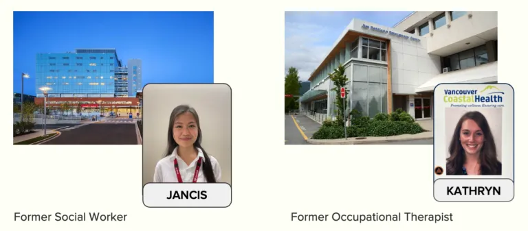
Prior to the UX program, I was a Social Worker working within the healthcare system.
The system is complex, and my teammate and I understood some of the challenges it faced.
Background
Problem
The shortage of general practitioners leaves many people without family doctors to seek medical help in the emergency departments. On top of COVID-19, hospitals are at capacity, with an increase in burnout rates among healthcare staff.
To reflect the local health authority, Vancouver Coastal Health’s purpose statement is to:
“Come together as one collective team to deliver an exceptional care experience for all.” Vancouver Coastal Health
The emergency department (ED) is a key area that isn’t meeting the purpose because we know that many users have had negative care experiences. This is problematic as the ED serves as patients’ first point of contact with the hospital, setting the tone for their overall experience.
Background
How might we..
Optimize the ED experience in Metro Vancouver for people requiring same-day care, to increase user and staff satisfaction, while reducing the rate of user complaints?
Exploration
Investigate the ED
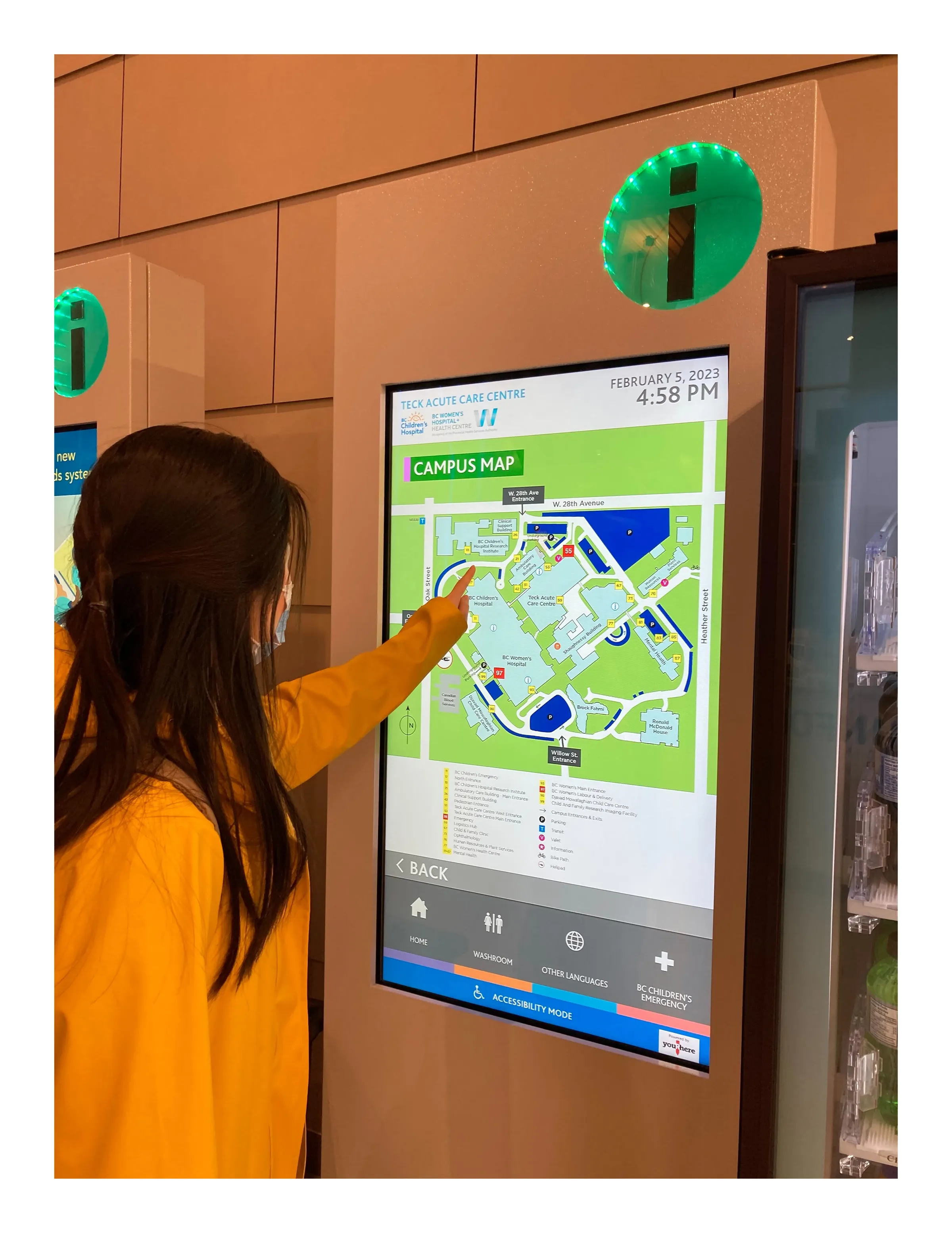
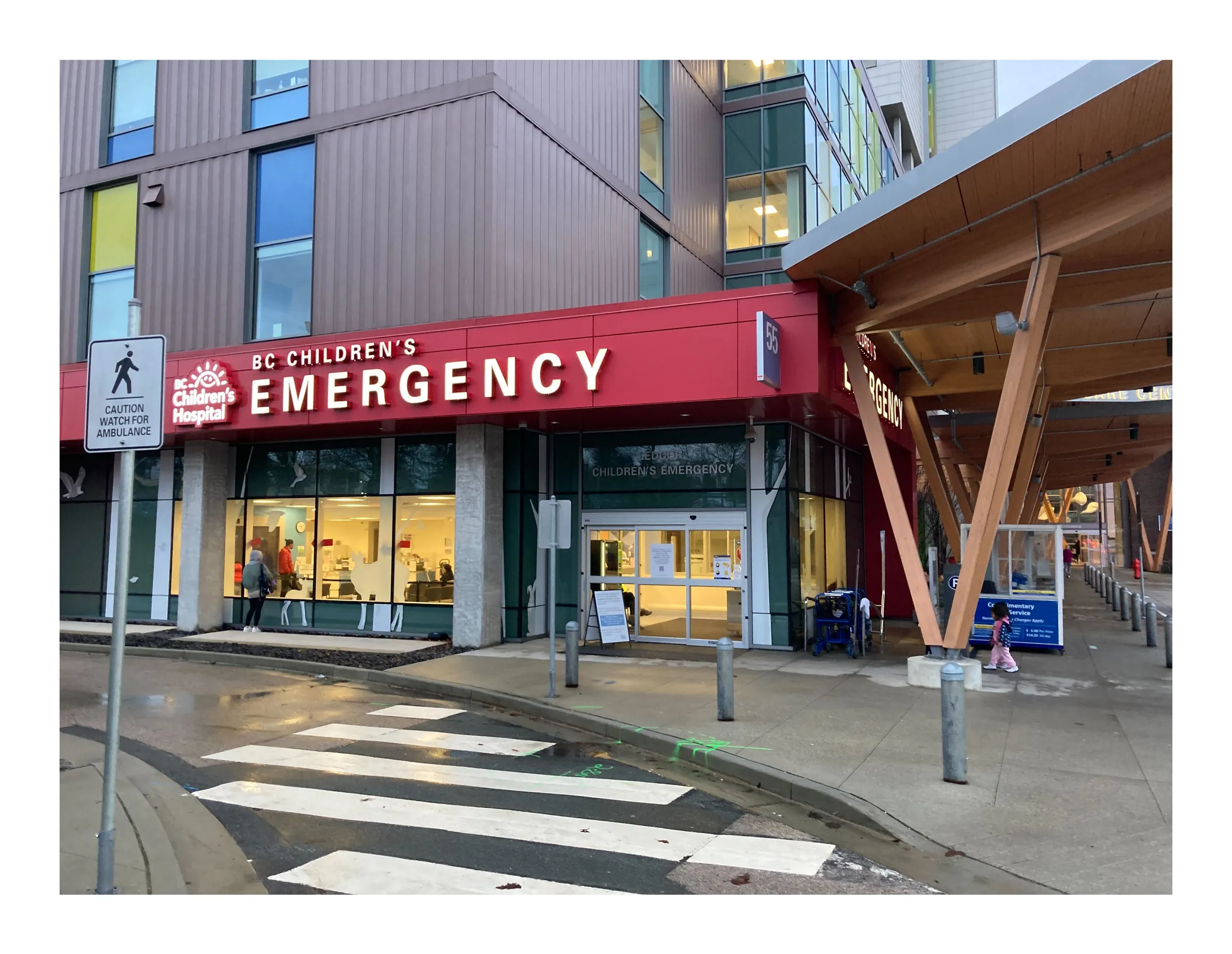
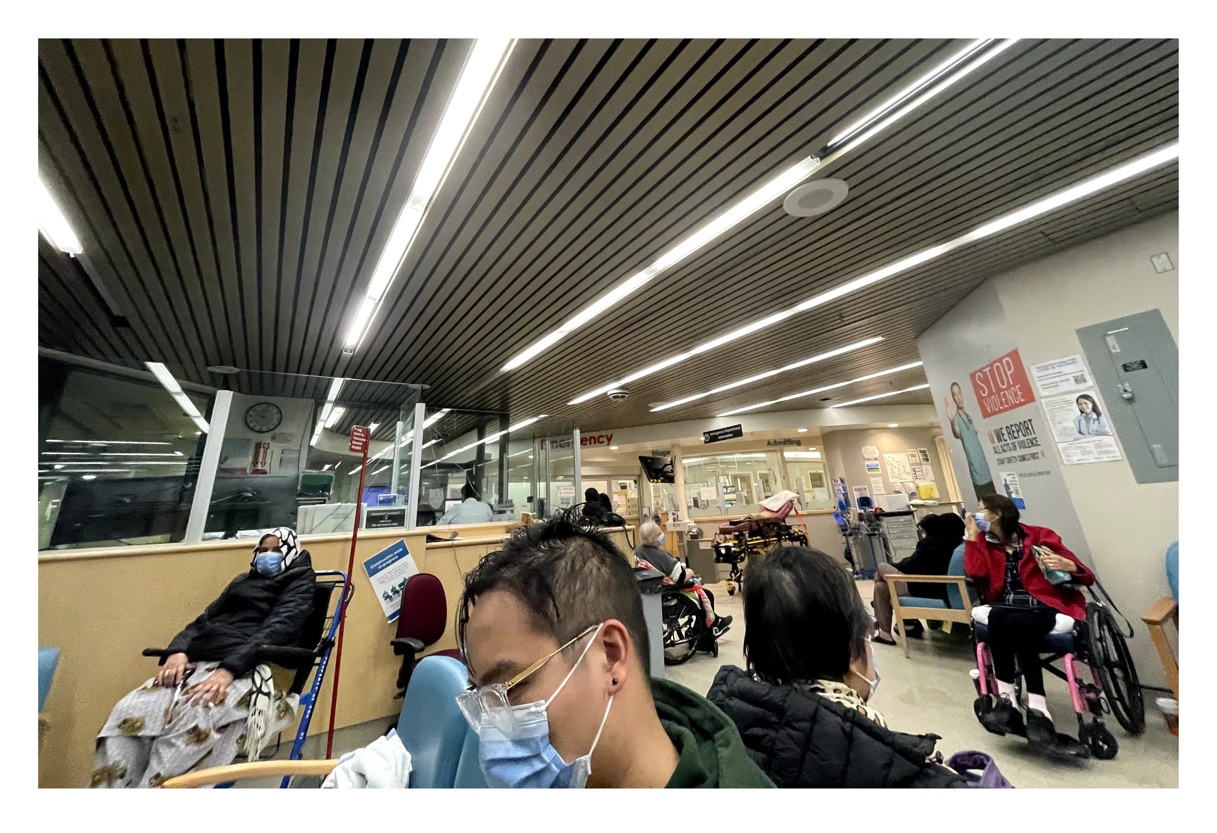
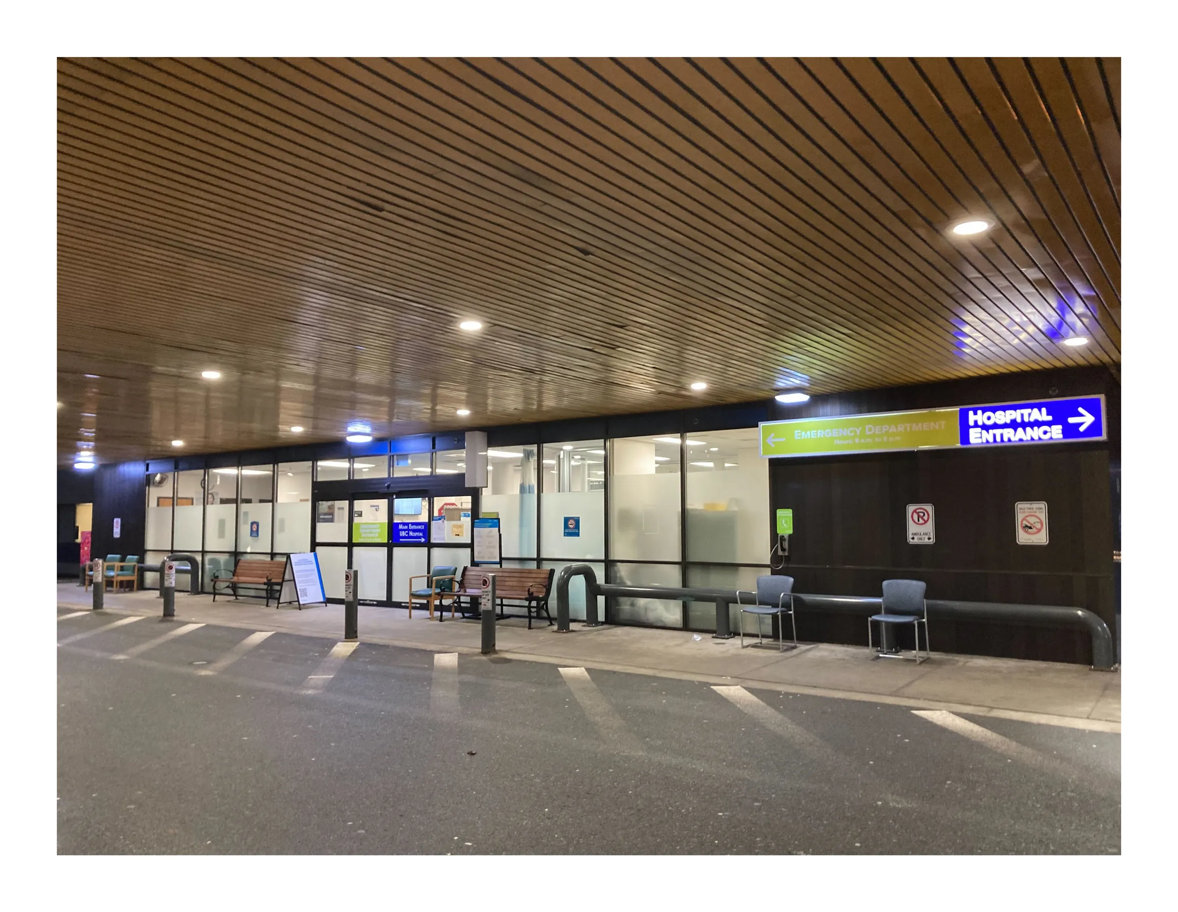
We completed site observations at 3 Vancouver hospitals, one of which I attended with a family member for health concerns.
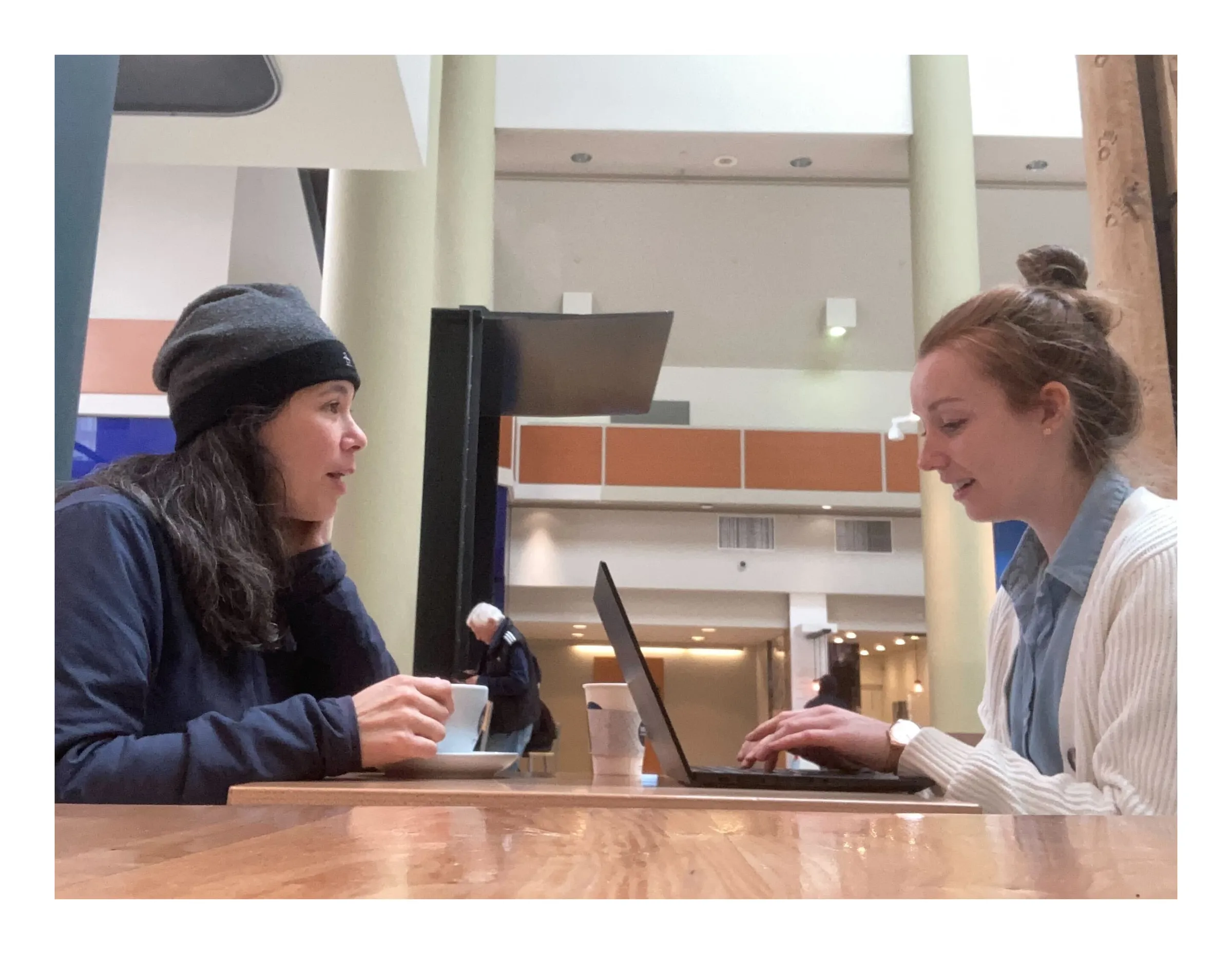
The first-hand experience helped us gather valuable information on the environment and process. We conducted 6 ethnographic interviews, including professional healthcare staffs, caregivers, and older adults.
insights
What mattered most?
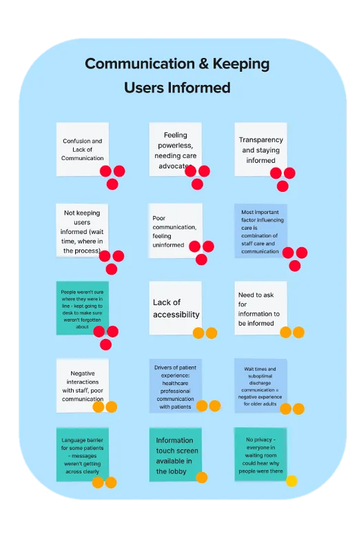
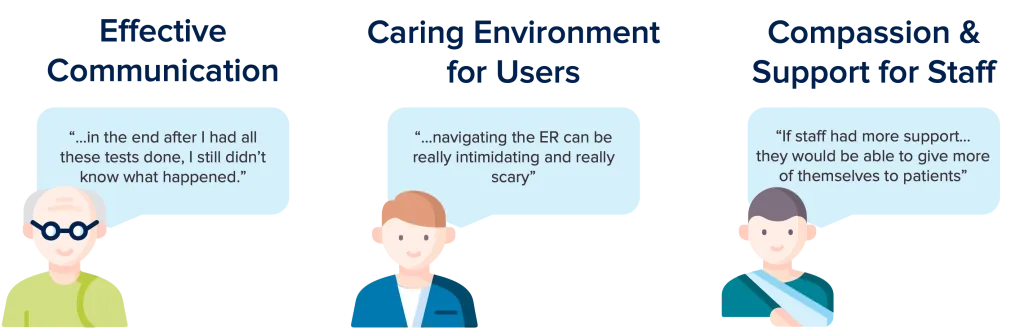
According to data, these are the top 3 insights that impacted people’s ED experiences:
- Lack of effective communication
- Require more compassion and support for staff
- Lack of caring environment for the public
Participants and research showed that effective communication ranked the most important and pressing to address. By tackling this key area, it can simultaneously make a positive impact on the other two insights.
Hear it, first hand
insights
Service Blueprint
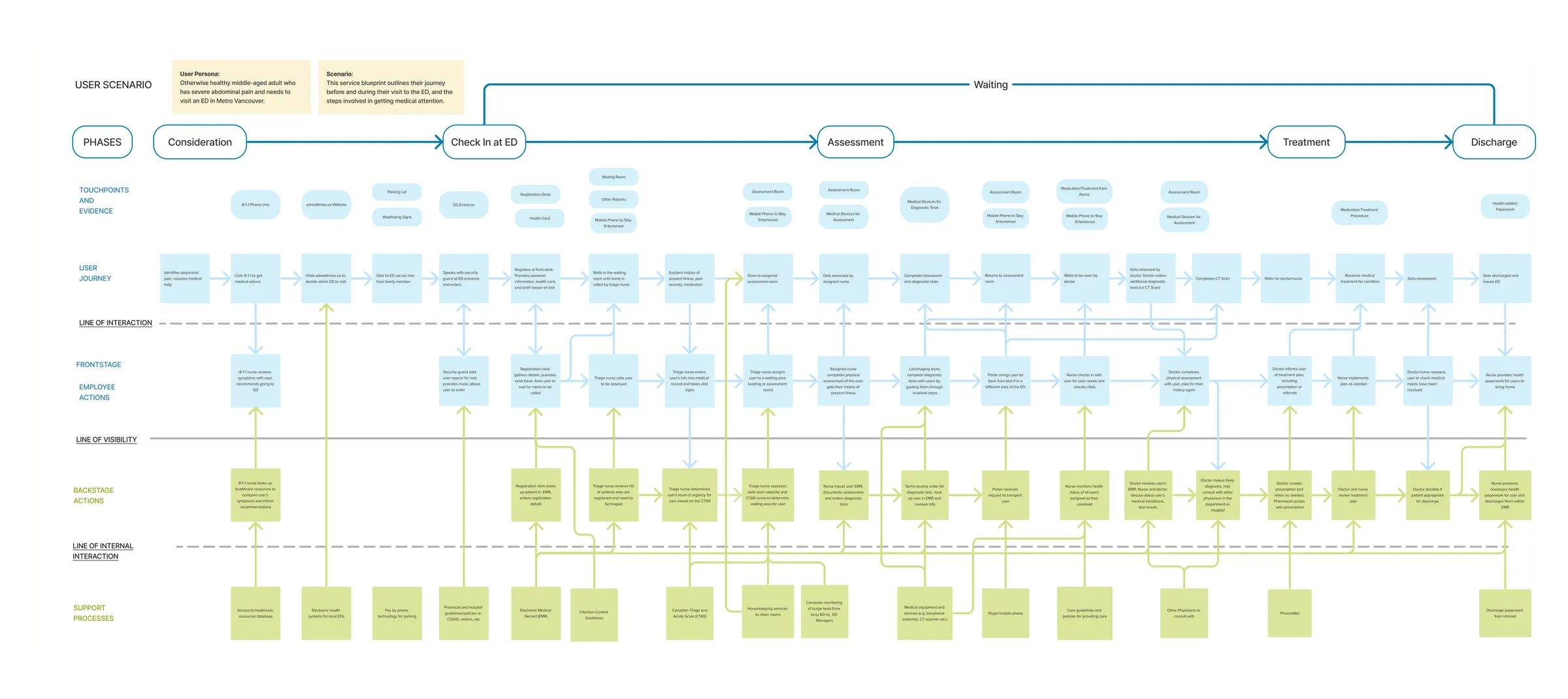
Through extensive research, we encapsulate the experience of a person going through the ED through a service blueprint. Starting from consideration, check-in at the ED, assessment, treatment, and discharge, we documented different roles (staff, janitor, front desk to the Emergency Medical Records system that are involved in the process.
Collaborate
Designing together
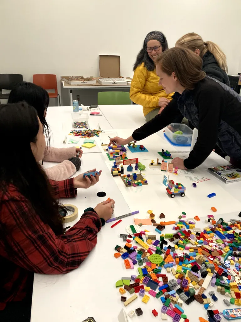
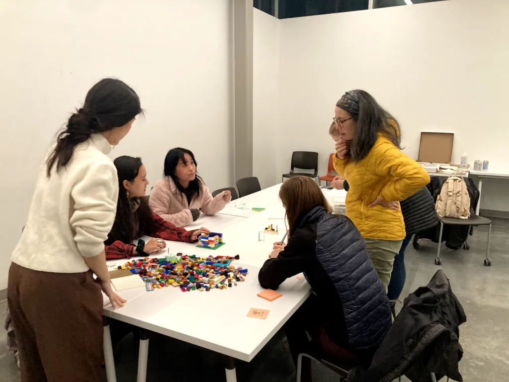
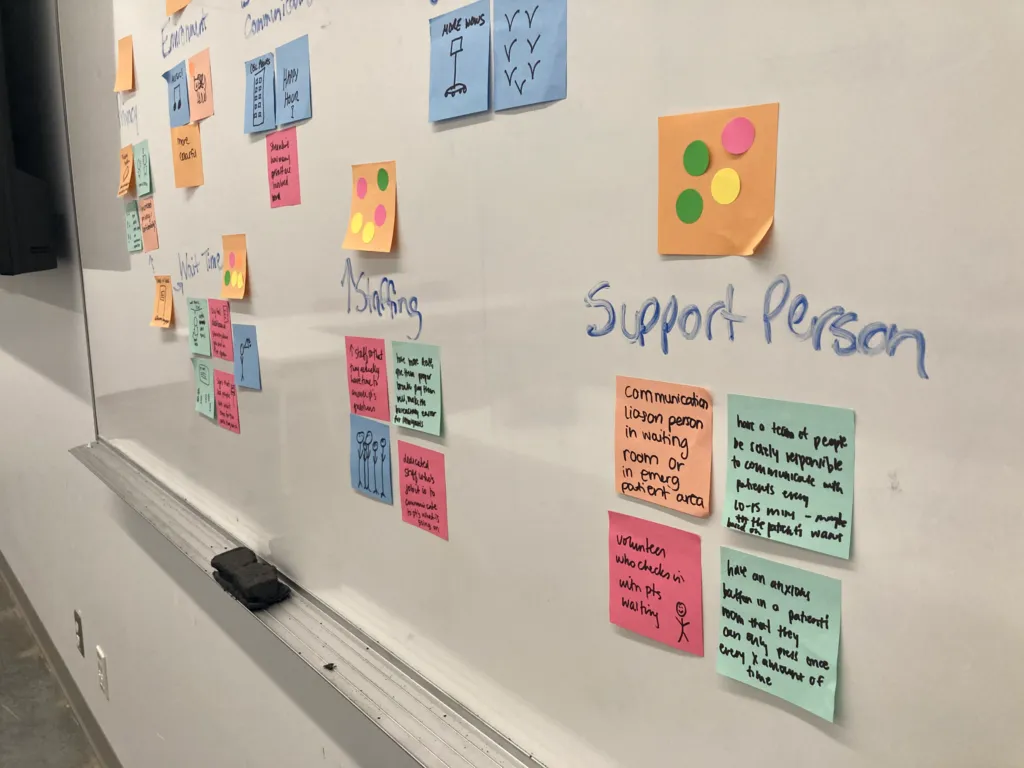
We hosted a co-design workshop that brought together 5 participants to understand each others’ perspectives and work collaboratively on solutions for change.
We facilitated Crazy 8’s, affinity mapping, and shared our findings with the group.
As a result, new ideas such as improvement around wait time, increased staffing, calming music in the waiting area, and a volunteer support person.
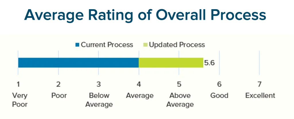
On a scale of 1 -7, participants rated the new process to be 1.5 higher than the existing ED journey process!
Desktop Walkthrough
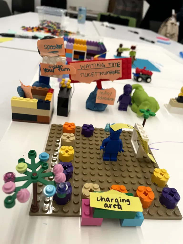
Video not yet migrated: Using their best ideas, the group created a desktop walkthrough to quickly simul. The source file is 175 MB, over GitHub's file-size limit — it needs re-encoding or external hosting.
Using their best ideas, the group created a desktop walkthrough to quickly simulate an updated ED process. This demonstration is the first step to what a reimagined, improved ED experience looks like in the participants’ eyes!
outcome
New Process
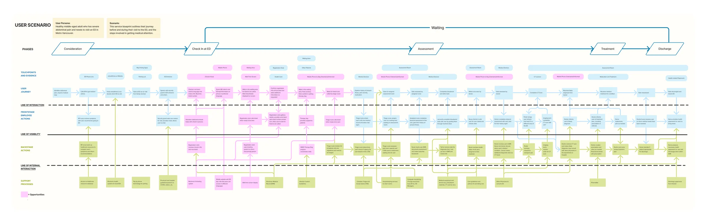
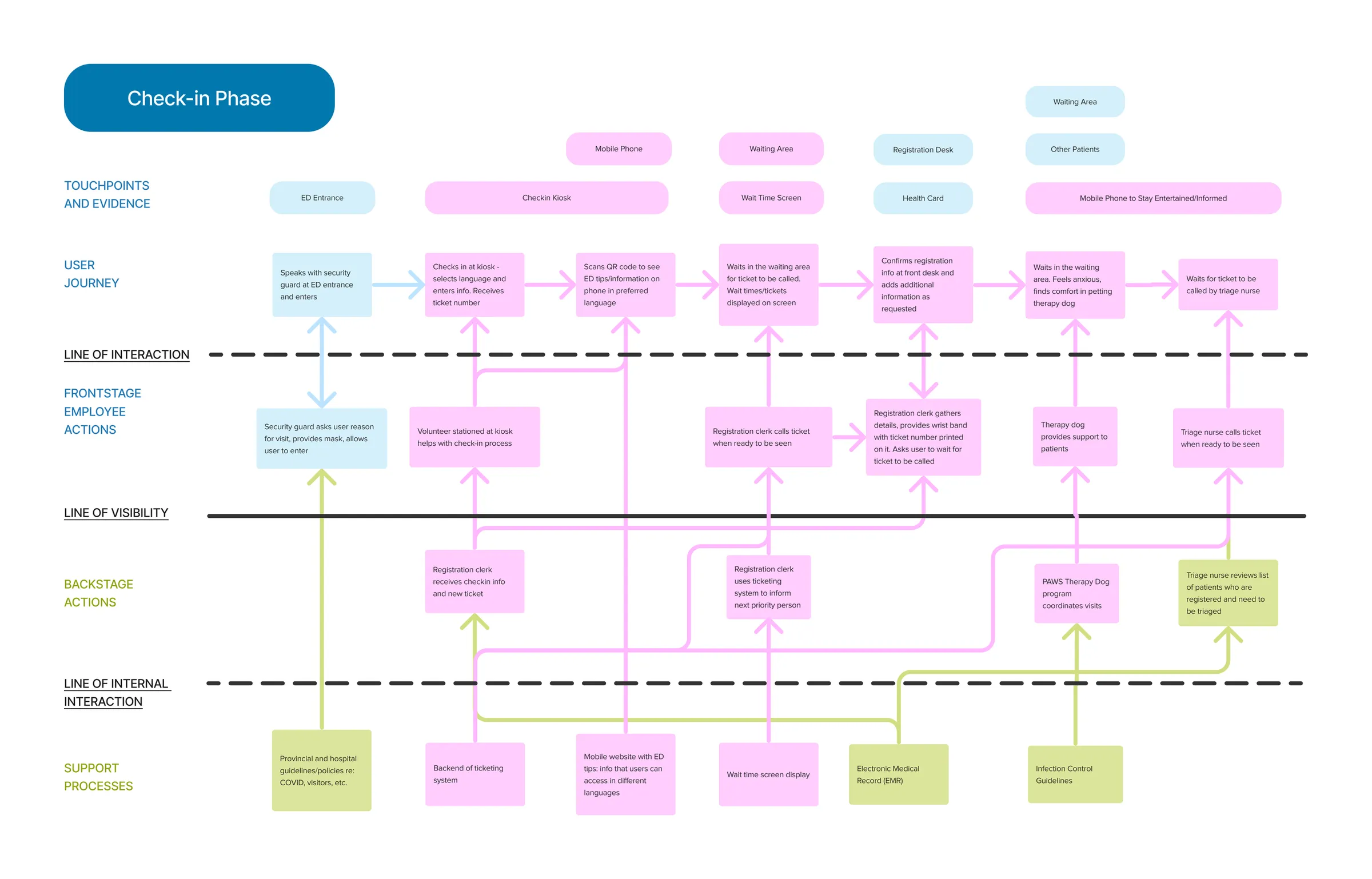
On the reiterated service blueprint, the new opportunities mostly focused on the check-in phase. Some opportunities included are:
- wait time ticketing system
- Dog therapy visits to provide anxiety relief
- Speakers in the washroom to notify the user of the ticket number
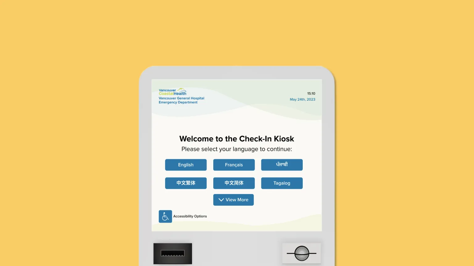
Check-In Kiosk
outcome
Streamlined Registration
One of the biggest additions to this updated process was a check-in kiosk.
This would provide a streamlined registration option for users who do not require immediate attention while directing those with urgent medical needs to proceed to the registration desk.
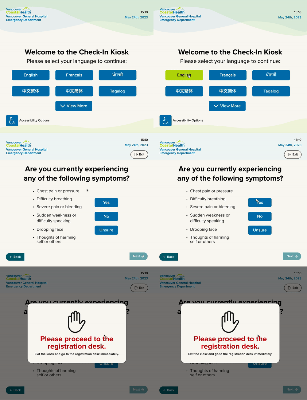
Enhanced Efficiency
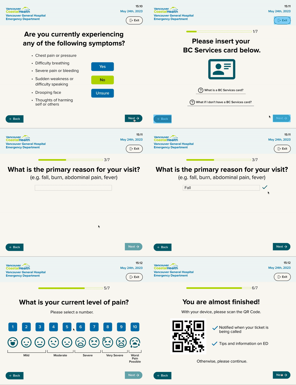
The kiosk would improve the check-in experience by efficiently collecting personal health information, issuing a wait time ticket, and providing a QR Code to access useful information about the ED visit.
To maintain confidentiality, the screen size is around 13” for optimal display of information.
Accessibility
Living in a multicultural city like Vancouver, language barriers can limit users’ access to healthcare.
To accommodate users with diverse needs, the accessibility mode features an audio function, zoom capability, and selection arrows for improved access to onscreen navigation.
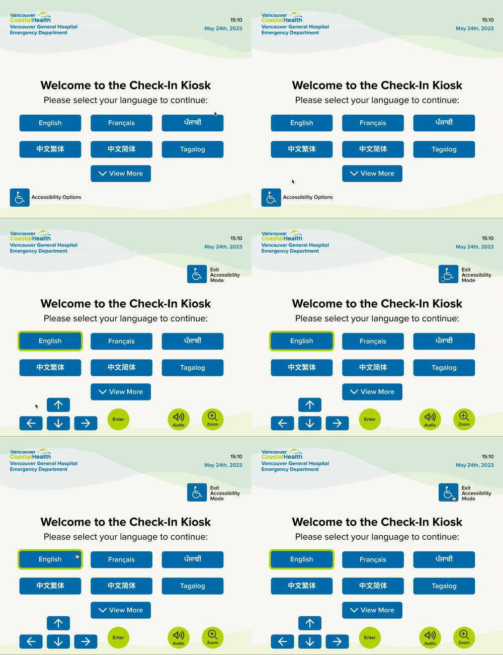
accessibility mode on check-in kiosk
Design decisions
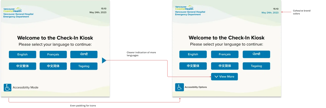
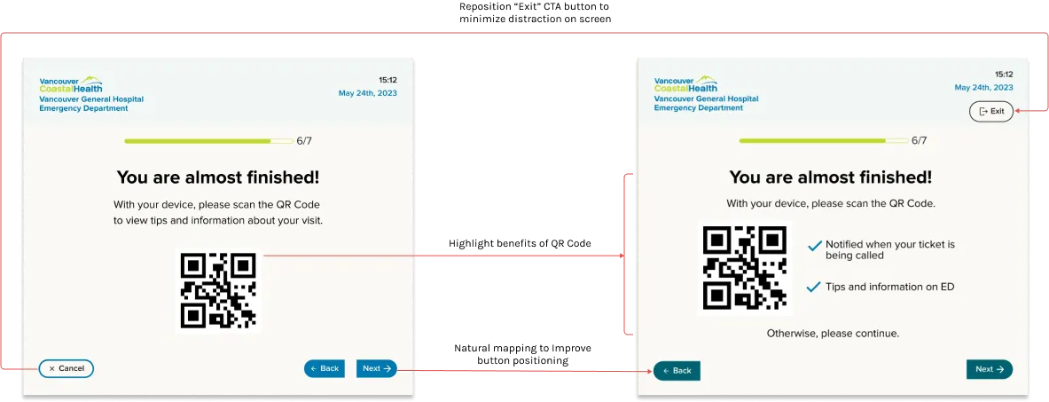
Before and After
We demonstrated our mock prototype in a peer review session, where 12 people provided feedback on the kiosk.
Generally, peers think the brand is professional and resembles Vancouver Coastal Health, as well as it contains clear and concise copy.
Some users indicated the back and next buttons were too close to one another. Another asked if the positioning was the most efficient way for people to finish registration.
With the feedback, I focused on the main objective to get people to check in by reconfiguring the natural mapping of the buttons.
Effective Solutions
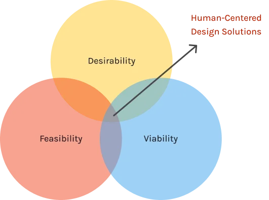
Utilizing IDEO’s design thinking framework, our solutions are not only feasible but have been proven successful in emergency departments across North America. Implementing ticketing systems, wait-time displays, and digital check-in kiosks will enhance the patient experience by providing them with a sense of care and information, ultimately reducing patient complaints and increasing satisfaction rates.
Furthermore, streamlining the check-in and wait process can improve patient flow, reduce administrative workload and stress for staff, and save on staffing expenses. Overall, our solutions prioritize the needs and experiences of patients while also improving operational efficiency and reducing costs for the hospital.
Fulfill B.C Healthcare Needs
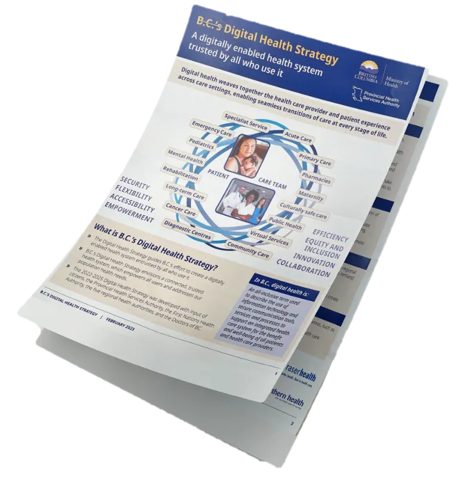
More importantly, these solutions are supported by the B.C’s Digital health strategy as our solutions fulfill their top 2 main objectives --- to empower patients and improve the provider experience.
Reflection
- Holistic design requires organizing and balancing diverse perspectives to capture the complete experience. This is one of the strengths distinct in service design work to build a full picture of a complex system.
- Our work was constrained by system limitations, resulting in missed opportunities in crucial areas, such as low staffing. We couldn’t devise practical solutions due to the absence of viewpoints from certain stakeholder groups, like Vancouver Coastal Health’s leadership.
- All in all, being a designer I learn to trust in the process, embrace ambiguity, and be comfortable with not knowing everything.
Next Steps
I will conduct further usability tests of the check-in kiosk with users.
To be able to do that, I would also be reaching out to VCH or other local healthcare authorities regarding these solutions as possible implementations.
Other Projects
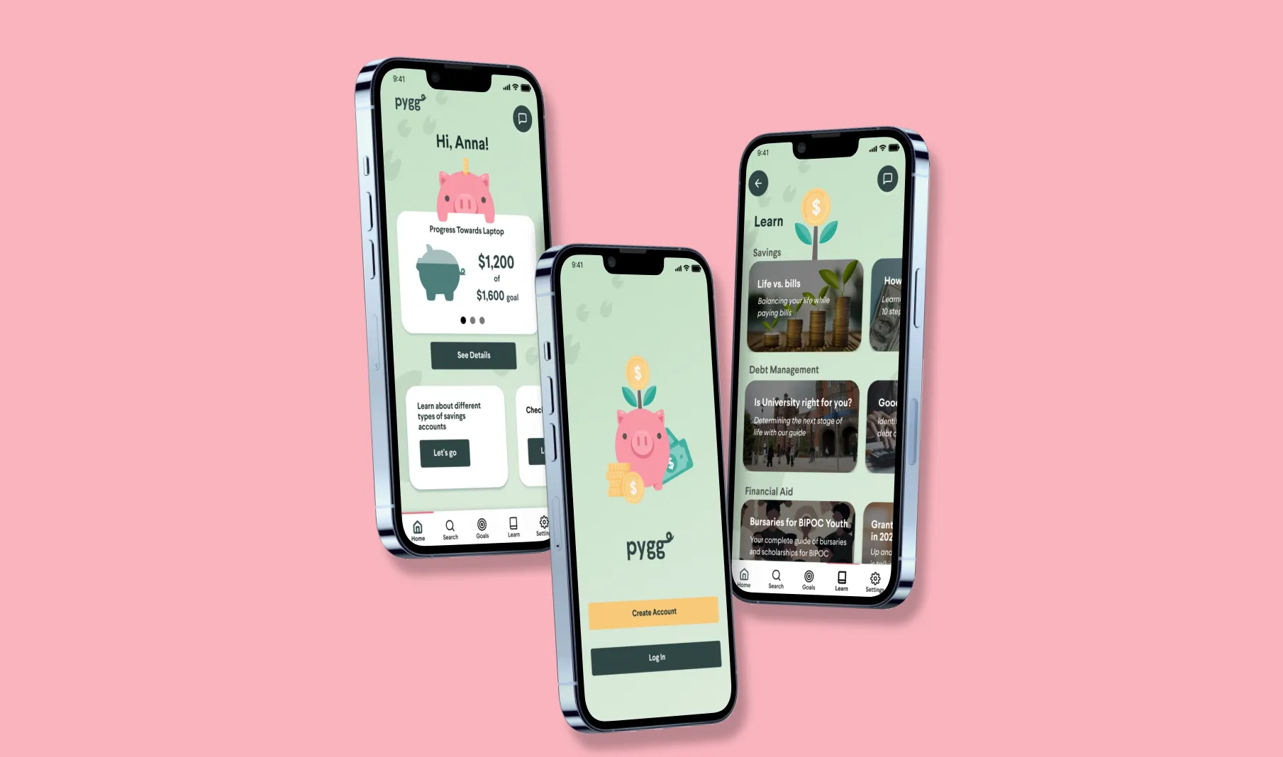
PYGG App
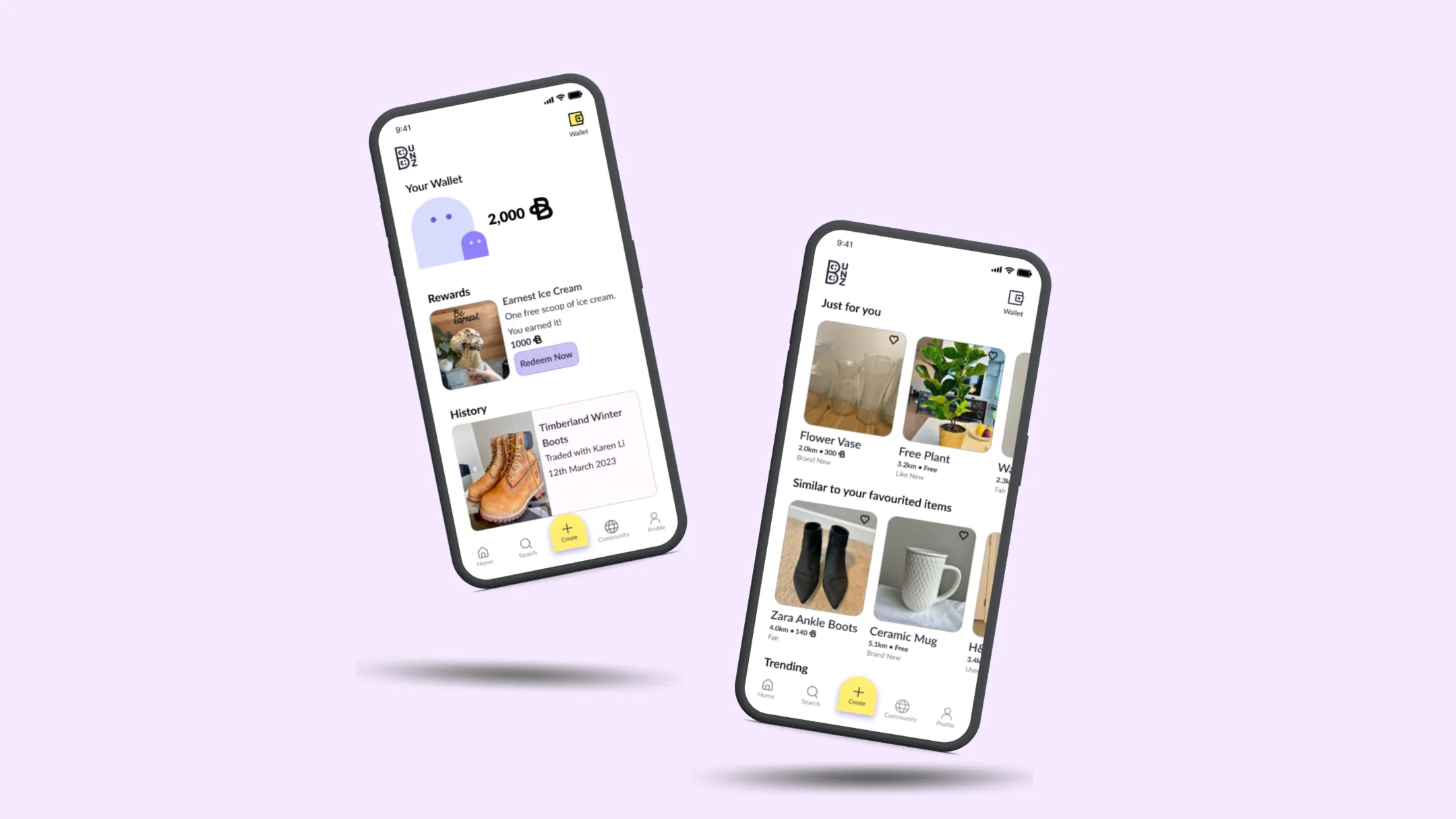
BUNZ
Stay Tuned. Coming Soon!